Neutrogena
Brand Redesign
ROLE:
BRAND REDESIGN
FOCUS:
fafjadklf
TIMELINE:
3 WEEKS
TOOLS:
ADOBE PHOTOSHOP
about.
Neutrogena already had the trust, accessibility, and science-backed reputation. What it was missing was a visual system that felt as current and considered as the products themselves. This conceptual rebrand explores how the brand could feel more cohesive and relevant to a younger audience without losing the credibility that already makes it recognizable.
This is an academic concept project and was not created in collaboration with Neutrogena.
the problem.
The biggest issue was inconsistency. Different product lines used different colors, typography, layouts, and packaging structures, so the brand felt more like a collection of products than one connected system.
The clinical black-and-white identity helped communicate trust, but it also made the brand feel cold next to newer skincare brands. Dense labels and dated typography added to the problem by making products harder to scan.
Looking at CeraVe helped define the opportunity. Its products change across categories, but the typography, structure, and color logic stay consistent. Neutrogena did not need a completely new identity. It needed clearer rules.

rebrand.
I built the new direction around two sides of the brand: science and wellness. Science shaped the structure, hierarchy, and clarity. Wellness brought in softer imagery, warmer tones, and a more natural visual language.
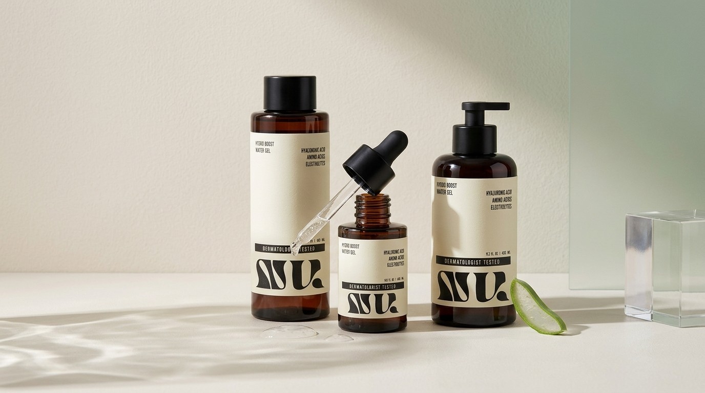
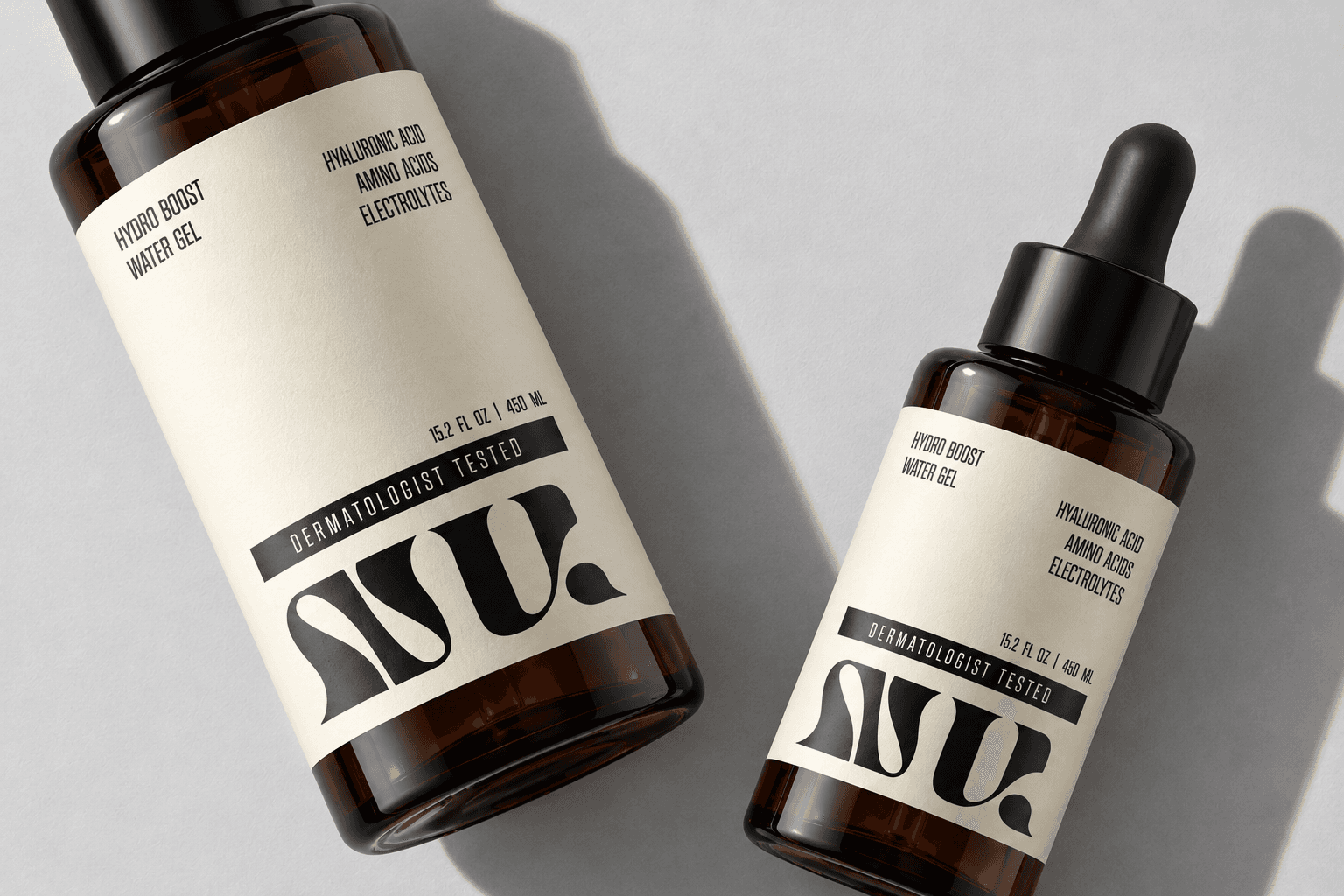
The packaging uses repeated label structures, consistent logo placement, and simplified information hierarchy so each product feels different without breaking the system. Warm neutrals, muted greens, and black create a softer palette while still keeping some of Neutrogena’s authority.
The NU monogram adds a more ownable brand element, using curved forms inspired by hydration, movement, and skin. The goal was to make the identity feel more premium and intentional without turning Neutrogena into a luxury skincare brand.

campaign.
The campaign takes the rebrand beyond packaging and shows how the identity could actually behave in motion.
Instead of loud, highly polished skincare advertising, I leaned into slower pacing, natural lighting, close-up textures, ingredient-focused visuals, and everyday routines. The content was designed for Instagram and TikTok, where shorter formats could communicate both the product benefits and the sensory side of skincare without relying on heavy product messaging.
The campaign included a storyboard, a longer-form commercial, and short-form social videos, all built around the same idea of making skincare feel more calm, intentional, and real.
The campaign reflects an earlier version of the packaging. After filming, I refined the identity further to make the system feel more distinctive and cohesive.


result.
The final direction turns Neutrogena into a more connected system across packaging, typography, color, imagery, and campaign content. Each part follows the same visual logic, making the brand easier to recognize while still leaving room for different products and formats.
Revisiting the packaging after the campaign was also an important part of the process. It made me question my first solution, notice where the work felt too familiar, and push the identity into something more ownable.
The biggest takeaway was that a brand system works a lot like a product system. Individual pieces can look good on their own, but they only feel strong when the rules between them are clear.
Skincare, reduced to its essence.